ShopDreamUp AI ArtDreamUp

Deviation Actions

HG Designs Subscriber Area
Lots of high resolution goodies for graphic design including textures, photoshop brushes, seamless patterns and more.
$8/month


Suggested Deviants


Suggested Collections


You Might Like…


Description
Please READ the description in the pic, at the bottom, which is pretty readable.
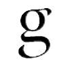
Modern9 is a conceptual font, and is for display only, however I do encourage you to use it for titling.
Notes: I may add some more ligatures later on, for titling.
Modern9 is a conceptual font, and is for display only, however I do encourage you to use it for titling.
Notes: I may add some more ligatures later on, for titling.
Comments15
Join the community to add your comment. Already a deviant? Log In
its a very good font....very elegant 